


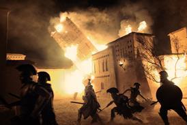


The crafts team from Poor Things had to enable the protagonist’s epic journey through London, Paris, Lisbon, Alexandria and on a vintage ocean liner. Screen talks to Shona Heath and James Price (both production design), Holly Waddington (costumes) and Nadia Stacey (hair/make-up) about creating the off-kilter, freely imagined worlds of the film.
The edict from director Yorgos Lanthimos at the genesis of Poor Things was daunting: “Yorgos wanted the film to look like it could never exist in the real world,” recalls production designer James Price. “He said to us, ‘I want it to look like nothing has ever looked before.’” Three years later, it is mission accomplished, thanks to years of work by dedicated and imaginative crafts experts.
For the Victorian-era film’s production design, it was a task so large that Lanthimos invited two production designers to collaborate: Price came from a more traditional film and TV background (with credits including Paddington 2, The Nest and the upcoming The Iron Claw); Shona Heath came more from the worlds of fashion, art and photography, collaborating for 20 years with photographers such as Tim Walker and fashion houses including Dior and Prada.
“We have different skillsets, but we actually did everything together,” says Heath. “James tends to do the bigger picture and work down, and I do the details and work up, and we come together in the middle.” Price adds: “If you tried to do all this on your own, you would fail miserably.”
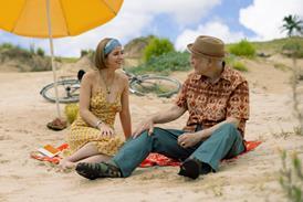
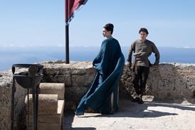
The pair were tasked with creating many worlds inhabited by Bella Baxter — played by Emma Stone, who is also among Poor Things’ producers — created in the book of the same name by Scottish author Alasdair Gray, and adapted for the screen by Tony McNamara (The Favourite). Bella is a young woman brought back to life, anew, by daring scientist Dr Godwin Baxter (Willem Dafoe). On her accelerated journey of growing up, she begins essentially as an infant in an adult’s body at Baxter’s London house. She travels to Lisbon with her first lover Duncan Wedderburn (Mark Ruffalo); then on an ocean liner that takes her to Alexandria; to working in a brothel in Paris; and back to London as her own woman.
Lanthimos initially showed Heath and Price several paintings, including a detail from Hieronymus Bosch’s ‘The Garden of Earthly Delights’, and one by Egon Schiele of a young woman with long, dark hair, pale skin and spindly limbs that would influence the look of Bella. “Yorgos only showed us a few things, and he was reluctant to do that, but it was so helpful to see something visual,” recalls Heath. “It gave us more freedom that these were paintings, not photographs to reference because it allows for more imagination.”
Lanthimos also asked key department heads to watch a selection of films — not necessarily for direct references but as general inspirations. Those included Michael Powell and Emeric Pressburger’s Black Narcissus, Federico Fellini’s And The Ship Sails On, several films by Roy Andersson, and Bram Stoker’s Dracula by Francis Ford Coppola.
Heath and Price’s collaboration started in early 2020, before the pandemic. Heath recalls: “We gathered a team together of seven of us and started creating ‘the bible’ where we really got into the DNA of the world, together with 3D modelling, concepts, sketches and lots of references. It was a very intense month doing that.” The bible of more than 100 pages was circulated to help the whole crafts team.
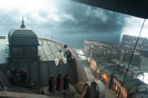
In spring 2021, the builds started at Hungary’s Origo Studios and Korda Studios: the longest build was to create Lisbon, which took 22 weeks, London took 16 weeks, Paris was about eight weeks, all happening concurrently. More design work was added as the builds continued, and as shooting — which began in August that year — was in progress. “I don’t think that would have been possible if we didn’t have this bible guiding everyone,” Heath says.
Peculiar architecture
The first location designed was the house for Dr Baxter. “We thought about how Baxter would have made his house for himself first, and then for Bella,” explains Heath. “We had this medical genius who wasn’t afraid of trying new things, cutting things up. So we implemented that into the peculiar architecture of the house — there’s a bridge in the atrium, and the stairs were very precarious.
“Bella is a huge toddler at first, so the walls in her bedroom were curved and padded, quilted with depictions of landscapes and scenery so she could enjoy the outside world but without being let loose in it. The floor in the sitting room was like a mattress, which came from the script — she was meant to fall off the piano. Actually, you don’t see it being used, and it drove everybody crazy working on this spongy floor, but it was important for us having this level of detail, and it has a sense of humour.”
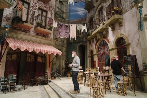
In Paris, Belle Époque looks were inspired by the work of French illustrator Albert Robida. “He was a futurist in the Victorian era,” says Heath. “We grounded ourselves in the Victorian era as if it was in a parallel universe. We could take it as a base but absolutely explode it and mess it up. We put electricity and plastics when those materials weren’t yet invented.”
“We had trams flying,” adds Price. “But sometimes we would go too far — or have something too plain — and get a raised eyebrow from Yorgos. We created theme-park kind of sets — you could wander around and get lost in these sets, which was really exciting but also challenging. You’d be doing one of those for most big films, but we had to do three cities as well as the ship. It was an amazing experience that we’ll never get again.”
On their toes
To make their jobs more challenging, “Yorgos had a feeling he might want to shoot some in black and white, but he definitely didn’t share this with us in advance,” recalls Heath. “He kept saying the textures needed to be bigger, deeper, stronger. So we ended up with textures on the walls and ceilings that were 20 centimetres deep. There wasn’t a smooth surface or a right-angle corner anywhere.”
They found out some the film would be shot in black and white only after 80% of Baxter’s house was finished. “We had to be bold enough to do whatever he wanted to do,” says Price.
For costumes and hair and make-up, the teams could draw from the design bible to start their own brainstorming, as well as some of the images from Lanthimos such as the Schiele painting of the woman with dark hair and pale skin — which became a touchstone for how Stone would look as Bella.
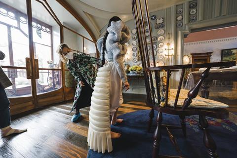
Costume designer Holly Waddington, whose credits include Lady Macbeth and Ginger & Rosa, was introduced to Lanthimos after working on Hulu series The Great created by Poor Things screenwriter McNamara. She created mood boards to show Lanthimos — “I thought the clothes needed to feel organic and of the body, particularly for Bella. And there were some nods to the silhouettes of the 1890s.” But she also had an open mind, referencing a book about Japanese dolls, for instance.
“I love to be able to play with a period,” says Waddington. “I’ve got a background in period costume — it fascinates me, and I also love to play with details. We found a book of 1890s patterns and some of the shapes were incredible, some of them were extreme. We really went for these big sleeves. What I love is that they are about empowerment — it’s power dressing.”
Despite those exaggerated sleeves, Stone could have a lightness in her outfits because Waddington and Lanthimos decided Bella would not wear corsets. “Also we didn’t ever dress her ‘correctly’ — the whole language of her clothes is quite modern,” adds Waddington. “Sometimes, like in Lisbon, it looks like she’s pulled her clothes from a dress-up box.”
Stone, as both the lead actor and one of the producers, was heavily invested in the way Bella looked. “What I loved about working with Emma is she’s less concerned about how something looks on her, she’s not vain — but she wants to know why you’re creating these looks — why does the wedding dress need to be like a cage?” Waddington explains. “She really listens and she just wanted it to work for the character.”
Creating the aesthetic
Waddington’s costumes had to work around the statement long, black hair of Bella. “That enabled me to use much bolder colours than I could have done if she was a soft blonde. For instance, I could use lots of yellow because black and yellow are fantastic together. That’s also the colour of a bee or a wasp, nature’s war colours.”
She found Lanthimos had an exacting way of talking about the palette. She had been showing him body-inspired colours for a range of costumes and he said, “You’re talking about the colours of a rotten apple… and his description was unbelievably accurate.”
Hair, make-up and prosthetics designer Nadia Stacey did not need convincing to join the project — she was a fan of Gray’s book and had worked with Stone and Lanthimos on The Favourite (winning a Bafta for hair and make-up) and with Stone on Cruella (picking up Bafta and Oscar nominations).
Bella’s make-up reflected her emotional journey — childlike at first, playing with make-up for the first time in the brothel. At other times, it is “stripped back — Bella isn’t shackled to society norms, she doesn’t need make-up to present herself to the world that way”, says Stacey.
Not many women could carry off pale skin and jet-black hair, but Stacey’s past work with Stone made her confident the actress could embrace the extremes. “Everything works on Emma. I knew her face could take this contrast, even though the hair went much darker than originally planned. It’s perfect, it gives her a kind of otherworldly look in the middle of this craziness of colour around her.”
Like Waddington, even if she is not working to period exactness, Stacey says she loves to do “masses of research — you have to know what you’re twisting and coming away from”. Regarding Bella’s hair, she even found “there are photos of a lot of Victorian women with really long hair”, although they would never usually wear it down in public as Bella does (the longest hairpiece for the character exceeded a metre in length).
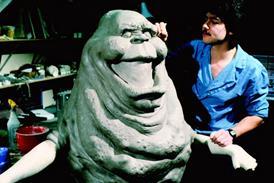
Stacey’s other challenges included Dr Baxter’s scarred face. For the Paris brothel keeper Madame Swiney, played by Kathryn Hunter, Stacey sold Lanthimos on covering the character’s body in tattoos — and she personally designed more than 100 individual inkings.
“It is the most creative you’ll ever be,” Stacey says of her work on Poor Things, which is produced by Searchlight Pictures and Film4, and begins its release via Disney on December 8. She admits it can also be “petrifying” to leap into the unknown with Lanthimos. But then “when it all comes together in this amazing, strange alchemy and your work is in the middle of all of that, I’m super proud”.
Dr Baxter’s patchwork face
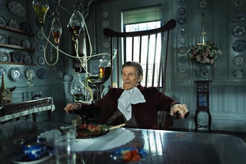
Hair, make-up and prosthetics designer Nadia Stacey found her greatest prosthetic challenges not with the anatomical dissections by Dr Godwin Baxter (Willem Dafoe) in the operating theatre, but with the patchwork of skin on his own face. “With Baxter, he’s in this world of cutting things and putting them back together,” Stacey says. “And he’s literally like a patchwork of a man that his father has operated on and cut things away and put things back. It all stems back to the details in the script.”
Stacey knew they had to find a balance where Dafoe’s face would not be masked. “Willem has an amazing face and you need to see him. We need to have empathy for Baxter, although his face needs to look shocking enough that they call him a monster in the street.”
The prosthetics were made as separate pieces, designed by Mark Coulier and applied in stages by Josh Weston, Robin Pritchard and Stephen Murphy. On set, they got it down to three hours of daily applications for Dafoe.
The actor was curious to know more about the prosthetics and how they related to his character’s journey. Stacey recalls: “If one piece is slightly lower on one side, or slightly discoloured, he just wanted to know why, what’s the story behind that?”


No comments yet